“Package design isn’t just about the imagery and typography. It’s about creating that all encompassing representation of the product and message; balancing the marketing, retail and licensing needs with the art you create.”

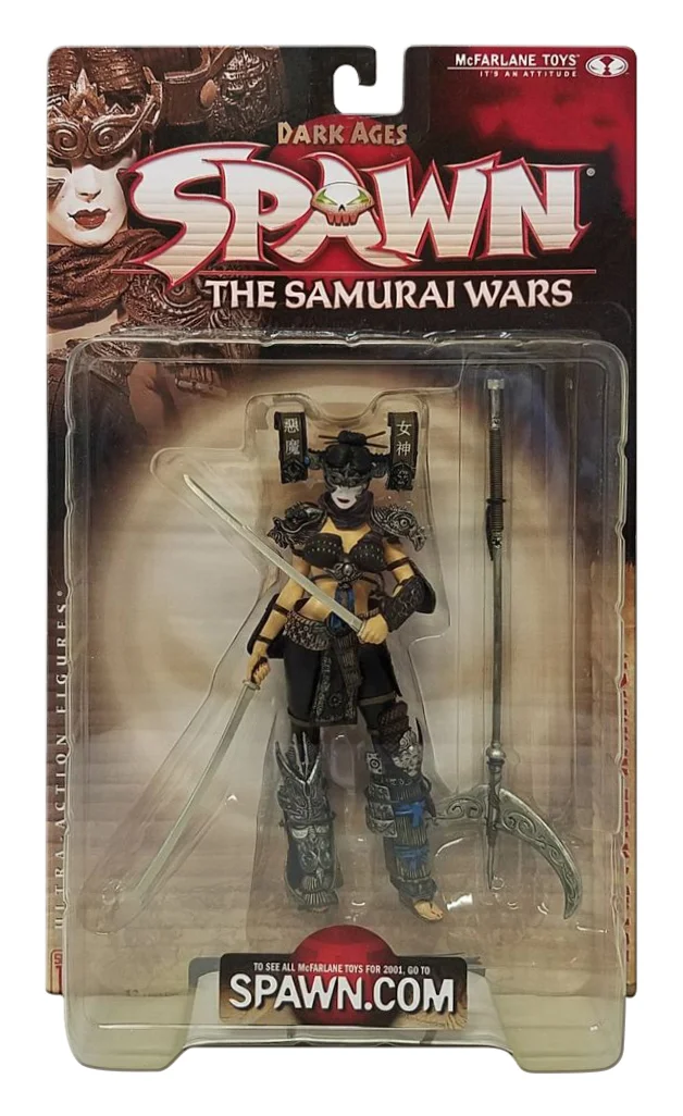
This was the first packaging I did for “Spawn” action-figures at McFarlane Toys, which was first called Todd Toys.

This was a challenge to create a package for McFarlane’s NFL figures that combined the styleguides of the NFL/NFLPA with EA’s Madden Video game. There was a lot of info and elements going on, but I think it came together cohesively in the end. This image is a digital render done in keyshot.


These LOST action figures all came with a very large bases, requiring a wide box. This gave me an opportunity to add a hinged panel to the box that I could feature the logo very large on it, but when opened you could see all that came with the figure.

I departed from our normal box design to a blister card package, just as it would be in the 80’s, the era the show was depicted. I added some “aging” graphics to help the illusion.


This was a design to reinvent how our figures were being marketed and hanging on the pegs at retail. Instead of the normal 4 to 6 figures from one license hanging together, we were offering the best figures from different franchises, but still have a cohesive look through all the different licenses, while keeping the feel of each brand.
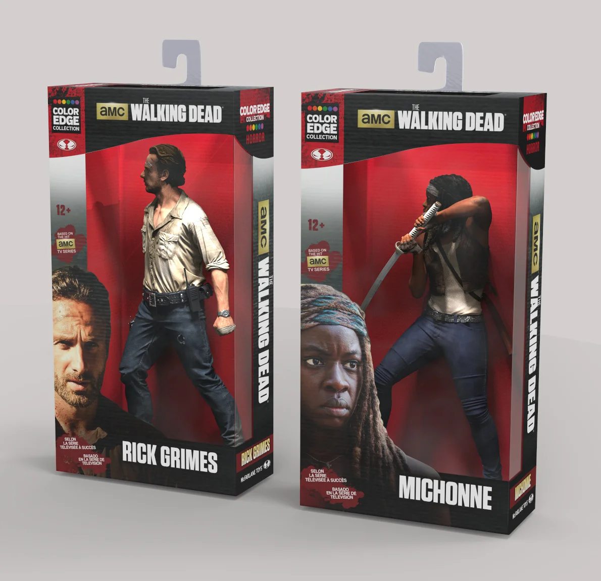
Here are two Walking Dead figures branded in the horror genre with red dominating the package.


I love when the opportunity comes along to mimic graphic styles from different eras. This particular packaging for MLB’s “Cooperstown Collection” enabled me to explore 4 different decades of baseball imagery.
This was my first endeavor using Keyshot, a digital rendering program for 3D models. I really enjoyed the freedom of bouncing back and forth between Photoshop and Keyshot, to arrange all the elements to come together, like pieces in a puzzle.


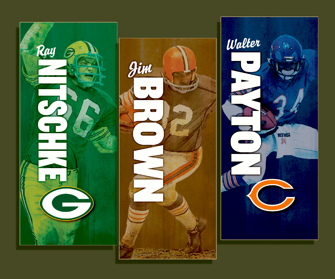
Working with a lot of filters in Photoshop, gave these photographs an illustrative look which lent itself well to these NFL legends who played in the 60’s and 70’s, when illustrations were more prevalent on sports magazines and program covers.


I remember Maurice Sendak wanted the packaging for his figures to look more like art and not like typical toy packaging. I used a watercolor paper texture for the background to help emphasize the art.

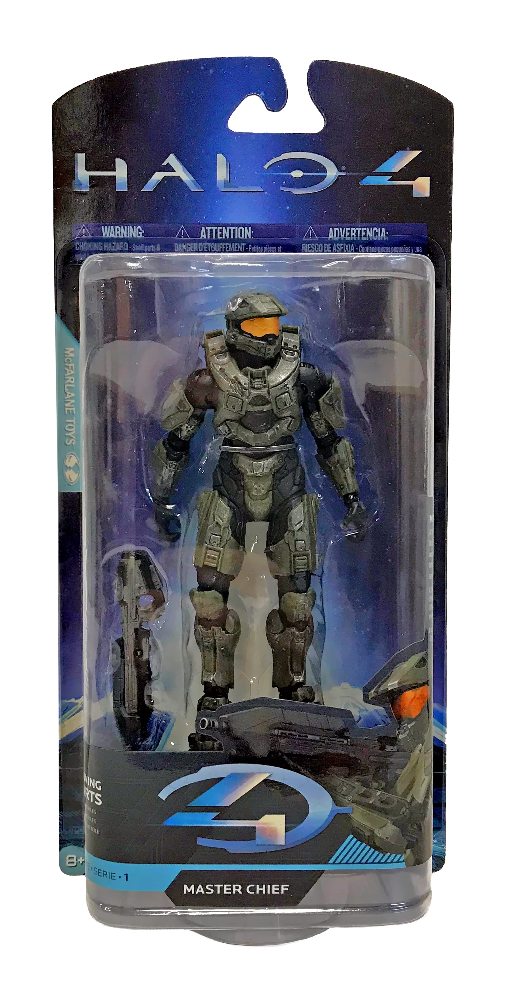
This was a redesign of a standard blister. I used angles to help feature the logo and character name, while not encroaching too much on the figure, as I had little width to work with on this particular job.

This was another example of working with a completely digitally sculpted and painted model. I had to play with the digital lighting on the model in Keyshot to match the lighting from “on set” photography in the background supplied by the licensor.

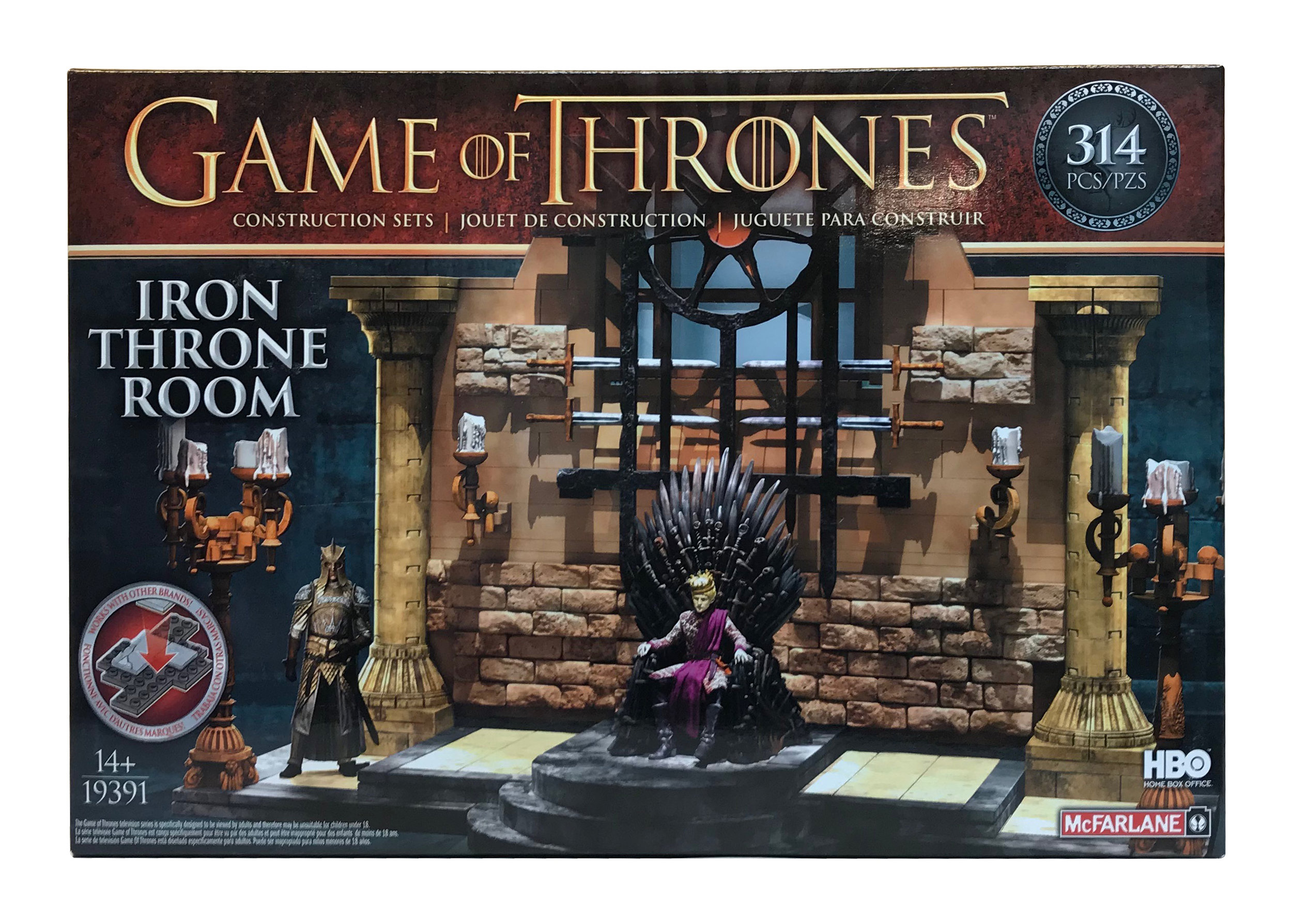
It’s always fun to try different looks from what you normally work with.

This was a fun “twist” to take normal imagery from fairy tales and give them a horrific look. I created the logo, but worked together with a talented designer on the packaging. Thanks Kari.


I had to create packaging that would have a family look among varied product, whether for lawn, water or sand play.


I created the name of the line, along with the logo and shot some of the photography, but worked with one of my designers, Ramsey, on this packaging to have a unique look.


I enjoy working on sports packaging. On this particular design, I played with the texture effects in Photoshop to create a textile pattern that you might find on a baseball cap where the logo sits.


Simply using the basic colors and typeface you would associate with a fire truck . . .
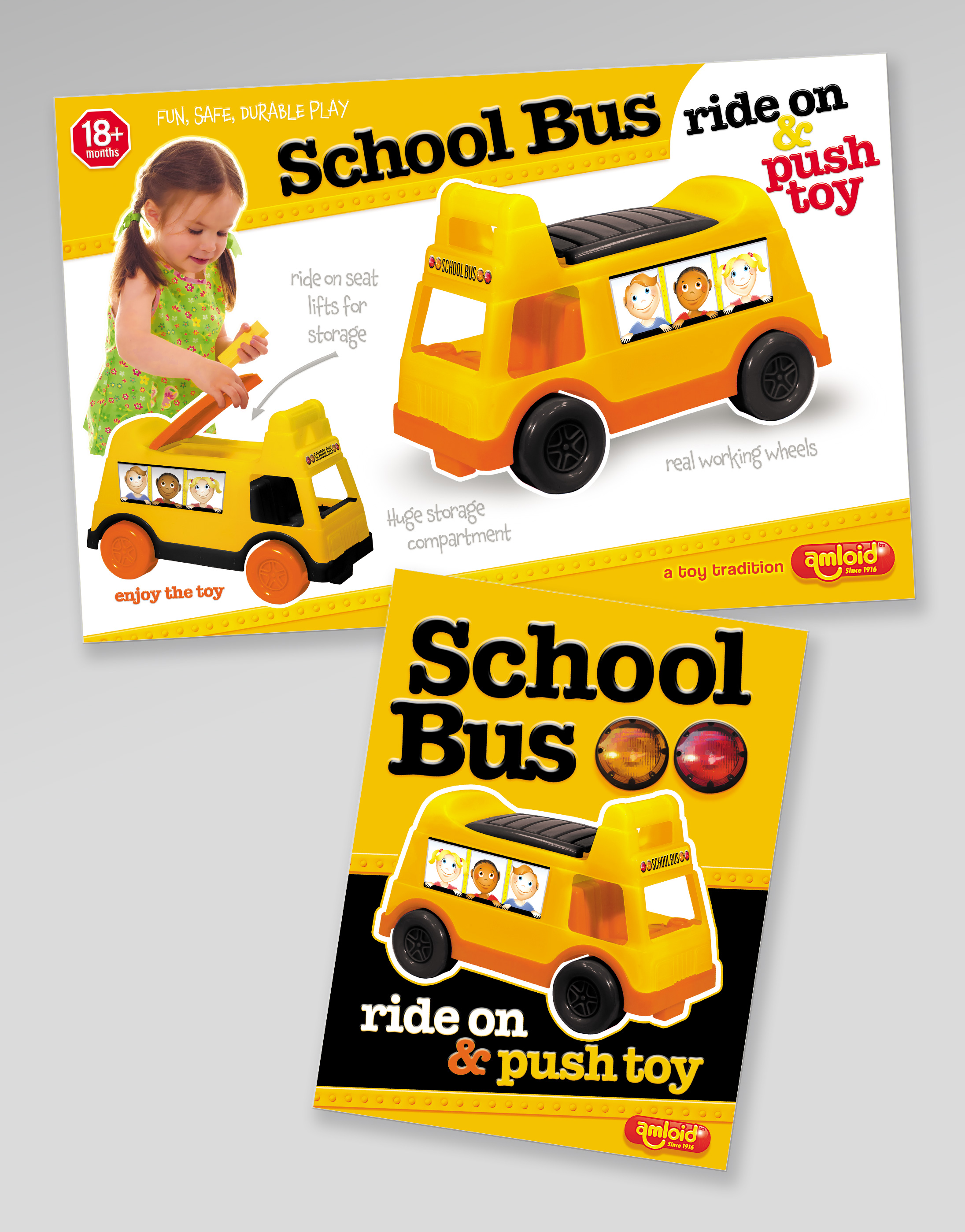
. . .or a schoolbus.

